Why the 60/40 Portfolio Could Be Sabotaging Your Financial Future—And What You Need to Do About It Now
The 60/40 portfolio—it’s like that reliable old friend who almost everyone turns to when venturing into the wild stock market jungle without overthinking every move. There’s a comfort in its simplicity and a track record that’s been good enough to persuade millions that they don’t have to be Wall Street wizards to grow their money. But here’s a kicker: beneath that steady surface lurks a sneaky flaw. When you peel back the layers of history, the average 4% annual return since 1900 isn’t quite the smooth ride it seems. Imagine a car that zips along effortlessly on sunny days but sputters to a halt on a frosty morning—that’s the 60/40 portfolio for you, especially glaring during the brutal 1947-74 stretch when returns lagged at a mere 1.7%. So, what does this mean for your hard-earned nest egg? Could relying on this classic mix in the wrong era stall your retirement plans or force you to dig deeper into your wallet? Stick around as we dissect the nuances of these market seasons and unravel why the bonds’ defensive shield sometimes has holes you don’t want to drive through. Ready to rethink your go-to strategy? LEARN MORE
The 60/40 portfolio is the default solution for millions of people who don’t want to spend time agonising over their investments.
The portfolio’s strong track record, simplicity, and appealing balance of attack and defence has convinced a broad swathe of the public that they can dip their toe into the stock market without getting their leg bitten off.
The problem is the 60/40’s track record conceals a major weakness.
While its long-term returns are good, those numbers are the average of different eras.
Decompose the 60/40’s returns by these divergent periods, and the industry standard portfolio looks more like a car that cruises along in fair weather, but struggles to start on cold mornings.
Here’s the break down in inflation-adjusted annualised returns (GBP):
| Period | 60/40 annual return (%) |
| 1900-2025 | 4 |
| 1947-1974 | 1.7 |
| 1975-2025 | 6.1 |
| 1947-2025 | 4.5 |
The 60/40 portfolio is 60% World equities and 40% All Stocks gilts – rebalanced annually. Data from JST Macrohistory , The Big Bang , Before the Cult of Equity , A Century of UK Economic Trends , St. Petersburg Stock Exchange Project , World Financial Markets , MSCI, FTSE Russell, Millennium of Macroeconomic Data for the UK, and ONS. May 2026. All returns quoted in this article are inflation-adjusted total returns (GBP).
The long-term average return since 1900 is absolutely fine. Achieving 4% annualised is a decent result.
But that average conceals a 27-year period of gross underperformance from 1947-74. The 1.7% annualised return earned during that era is 60% worse than the 4% long-run trend.
Experiencing that kind of outcome could mean delaying your retirement dreams, or you having to pour in more money to stay on-track.
Then again, the 60/40 has been in rude health ever since. It notched up a mighty fine 6.1% annualised from 1975 to the end of 2025.
Era checking
Unfortunately, those years from 1947 to 1974 weren’t uniquely blighted. It wasn’t a problem with all the vacuum tubes they used or something.
Rather, the record shows a repeating pattern of sub-par performance by the defensive component of portfolios when solely reliant on bonds. (And cash doesn’t look good either).
- UK government bonds lost 76.4% from 1947 to 1974.
- Cash lost 28% in this era, too.
And you wouldn’t have meaningfully staunched the losses by switching to some other bond type. We’re dealing with an intrinsic vulnerability of fixed income assets (bonds, bills, and cash) that was glossed over while the 60/40 was firing on all cylinders from 1975 to 2020.
No super subs
All would be well if I could just point you to a simple upgrade for the defensive part of your portfolio. Or if you could just swap in one of the many multi-asset funds that populate the 60/40 investment space like rows of slightly different shampoos in the supermarket.
I will come up with some suggestions by the end of this two-part series. But in truth the alternatives mostly come with the enough baggage to get you thrown off a Ryan Air flight.
At the very least, the solutions introduce complexities that are liable to prove unpalatable to the very people who most need a 60/40 type product.
Consequently, I think I should start by laying out as clearly as possible what ails the 60/40 portfolio, if you happen to rely upon it at the wrong time.
Rising rate eras: bonds on the blink
Bond prices typically drop when market interest rates rise.
If interest rates trend up for years then we’re living in a rising rate era, typified by increasing bond yields, falling bond prices, and bad times for bond holders.
The dynamic works in reverse, too. Long periods of declining bond yields are associated with rising bond prices and impressive returns on your bonds – a falling interest rate era.
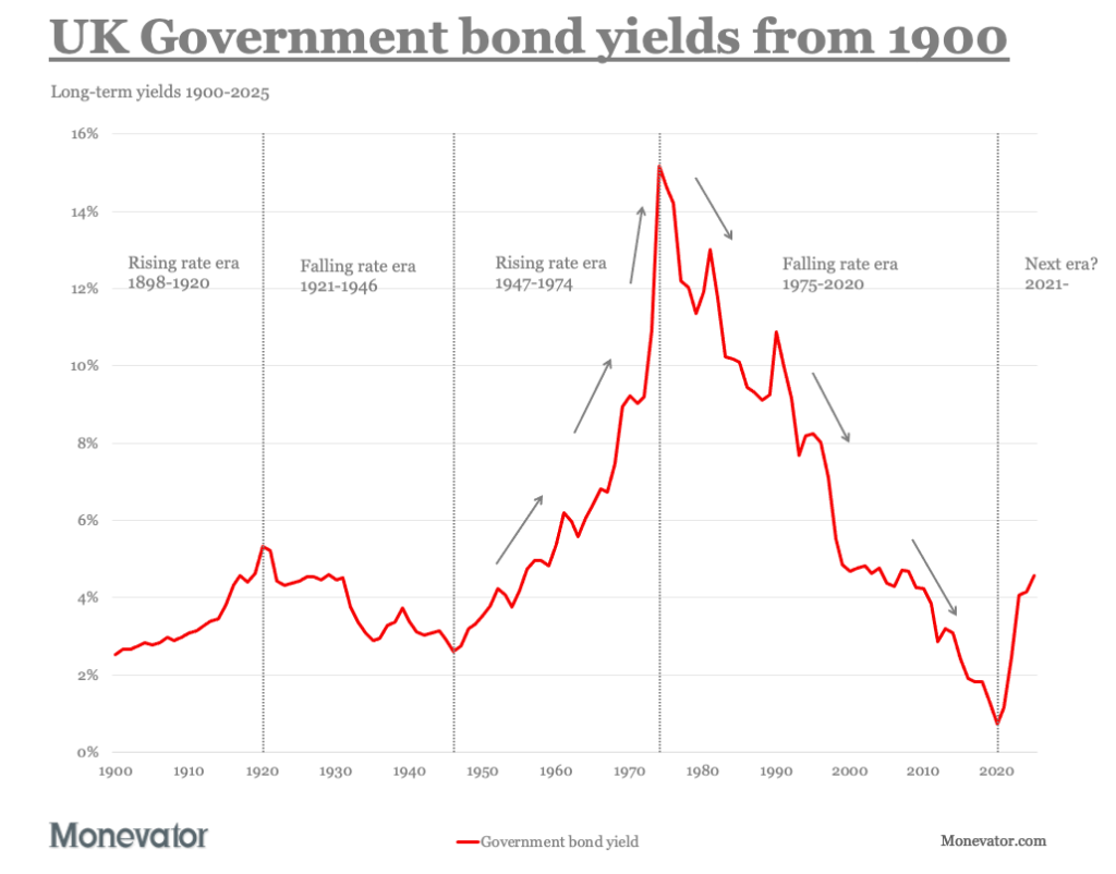
1947-74 was the textbook rising rate era, while 1975-2020 was a dream falling rate era.
The next chart shows the four interest rate eras that prevailed over the past century and a quarter.

Data from JST Macrohistory , Millennium of Macroeconomic Data for the UK, and Bank of England. May 2026.
The differing path for interest rates in these eras have a clear impact on bond returns:

The chart starts from 1900, though the left-hand rising rate era began in 1898.
(See the table below and the next chart.)
Here’s the cumulative bond returns per era:
| Period | All Stocks gilts return (%) | Interest rate era |
| 1898-1920 | -71.9 | Rising |
| 1921-1946 | 421.4 | Falling |
| 1947-1974 | -76.4 | Rising |
| 1975-2020 | 1067.4 | Falling |
| 2021-2025 | -40.3 | Rising so far |
The mechanism is straightforward enough. An interest rate rise forces down the price of existing bonds. That price drop means a capital loss for bond holders.
Why bond prices fall when rates rise
As an analogy, think about your situation if you put £100 into a five-year fixed rate savings account at 3%. And then imagine the next day an identical five-year product hits the market with a 4% interest rate.
Now you’re stuck in an uncompetitive savings account for the next five years. FML.
But what if you could sell your 3% savings account including your £100 deposit?
No-one would give you £100 for it, that’s for sure.
They would give you about £95.56 for it though. At that price, the buyer would still trouser a 4% yield if they held your weedier 3%-returning savings account until maturity.
The point: that 4% yield is the same as the 4% interest rate they’d earn by popping £100 into the shiny new 4% 5-year Cash Grabber+ saver account that just shot straight to the top of the Best Buy tables.
That’s the basic background.
When rates only rise
The upshot is that rising rates inflict capital losses onto existing bond owners.
That’s okay. The price will swing in the opposite direction as and when rates fall again. Or you’ll eventually make good the loss over time by reinvesting the proceeds of your bonds into new higher yield issues.
But what if the market keeps demanding higher and higher interest rates for holding bonds?
And you own a portfolio full of 10 to 20 year maturities?
Then the capital losses keep mounting up for your musty old bonds with weeny interest rates long since superseded.
That’s the root of the terrible nominal bond returns in rising rate eras.
The same clockwork unwinds in reverse during falling rate eras. Now your long bond is a must-have collector’s item. Market interest rates keep dropping, so buyers are prepared to pay you top dollar (or pound) for a 10-year gilt bearing a fat coupon rate from the good old days.
Again, if you held a 6% five-year savings account in 2009 when interest rates were evaporating, then you held onto it for dear life.
Are we in a rising rate era?
I can’t help but notice that rising rate eras generally follow on from falling ones in the yield chart above.
There have been sideways eras. But not since – um – the 18th Century.
Moreover, the shortest era in the table above was 23 years long. These trends seem to persist once they take hold.
It doesn’t help the case for the 60/40 portfolio that ten-year gilt yields have climbed like Spider-man since they bottomed out in 2020.
None of which is to pronounce that bonds are doomed. But the historical record does counsel caution.
There are still reasons to own bonds, but perhaps shorter duration ones than has traditionally been the case for mainstream British investors.
You might also want to think twice about holding a default 60/40-type fund if it’s full of conventional bonds, and doesn’t tilt towards the shortish end of the market.
Do two rising rate regimes make a pattern?
You may not need any further convincing but I hate to waste a good chart. Here’s how the regime change switcheroo has played out since 1703:

This pattern has form – including an idyllic century of moderate yield decline from 1798 to 1897.
It’s also intriguing that the April 2026 All Stocks gilt yield of 5.3% sits just north of the long-term average of 4.4%.
So you could argue that falling gilt returns since 2020 are the consequence of a normal yield reasserting itself.
One plausible scenario then, is that gilts now represent reasonable value, and no longer expose their owners to the risks compressed into the anomalously low interest rates of 2020.
Plus, there’s enough wiggle room in the chart above to disbelieve the notion that we’re condemned to some Kondratiev-style cycle of bond boom and bust.
But for me, this isn’t about trying to predict the future.
It’s about pointing out the gaping holes in the 60/40 portfolio risk story that appear when you don’t skip over the awkward parts of investment history.
How do bonds perform during the worst stock market crashes?
A critical role for bonds is reducing portfolio losses when equities implode.
So do they really? Including during rising rate eras?
The next chart shows how bonds performed during every World equities bear market of the past 126 years:

Data from MSCI, Before the Cult of Equity , A Century of UK Economic Trends , Robert Shiller, The Big Bang , Bank of England, Millennium of Macroeconomic Data for the UK, , Alan Stocker , British Government Securities Database , FTSE Russell, and ONS. May 2026. Pre-1970 World monthly returns are market-cap weighted UK and US equities returns (GBP).
And yes: UK government bonds only worsened the situation once – during the disaster of World War One.
The table below summarises the action above:
| World equities bear markets | Nine |
| Bonds increased losses | Once |
| Bonds reduced losses | Eight times |
| Positive bond return | Five times |
| Better negative return | Three times |
Better negative returns means that bonds weren’t as bad as equities. That reduced portfolio losses during the bear market.
That’s not unusual. Often it’s the best our defensive diversifiers can do.
Rise and fall
If we zero in on the three rising rate era bear markets then bonds did badly and exacerbated the situation once (WW1), responded positively once (Flash Crash ’62), and were just less bad than equities once (1970s). Whup.
By contrast, during falling rate eras bonds always improved 60/40 portfolio returns during a shock, responded positively four times, and were the lesser of two evils twice.
On this evidence, it looks like bonds’ ability to hedge equity losses is impaired during rising rate eras. Though it’s worth noting that six out of nine bears pitched up during falling rate periods.
On the defensive
I’d like more to go on, so let’s see how bonds perform as a diversifier when we examine every world equities’ drawdown from 1900:

When the gilt 12-month return line (ice blue) is above zero, it’s actively countervailing equity losses with positive returns.
When the blue line drops below the red stain, bonds are making things worse.
If the blue line is below zero, but doesn’t penetrate beyond the red, then bonds are losing money but less so than equities. At least that means they’d have hedged portfolio losses, though we might not thank them for it.
What I like about this chart is you can tell at a glance that the government bonds’ flight-to-quality story mostly holds up in falling rate eras.
But it’s much flimsier (though not non-existent) during rising rate regimes.
Notice, too, how gilts suffered a bear market loss in 2022 while equities did not.
Rising rate era corrections and bears
If I redo the diversification score card for the rising rate eras (including 2021-2025), and include every equity market correction beyond a 10% drop, then the picture becomes clearer:
| World equities corrections and bears | Ten |
| Bonds increased losses | Two times |
| Bonds reduced losses | Eight times |
| Positive bond return | Once |
| Better negative return | Seven times |
Bonds still mostly reduce losses when equities retreat, it’s true. But sometimes bonds aggravate your losses.
Mostly gilts are positively correlated with equity declines. Both assets sink together, but bonds don’t fall as far.
More to the point, bonds lost 5% on average per year during the rising rate eras of 1898-1920 and 1947-74.
That’s a steep price to pay for the leaky defence offered during those years.
Where does that leave us?
What fuels rising interest rates? Pick your favourites:
- Heightened fear of inflation
- Deteriorating public finances
- Mounting debt and fading belief in the capacity of the authorities to manage the burden
- Increasing risk of sovereign default
Hmm, nothing to worry about there then!
Actually my argument isn’t that bonds are broken, or bonds are fine, or that we must be in the grip of a new rising rate era.
My argument is that over-reliance on any single asset is setting yourself up for a fall because they can all fail to deliver for decades.
Though I’ve yet to discover a period when they all failed at once.
Multi problems
Multi-asset funds present a particular problem because while they may look diversified, they’re typically chock full of highly-correlated nominal bonds.
This means that a traditional 60/40-adjacent product will probably do just fine if rates fall again or even drift sideways. But it’s likely to disappoint if rates trend interminably upward as they have in the past.
In that scenario, standard-issue multi-asset funds are woefully under-strength in the assets that tend to compensate for nominal bond failings: specifically gold, commodities, and individual index-linked gilts.
For that reason, I can no longer cheerfully recommend all-in-one fund-of-funds to my friends and family who don’t give two hoots about investing but still need a pension.
The best answer is maximum diversification customised to your particular circumstances.
But I get that’s a heavy lift for most of my nearest and dearest – plus many visitors to Monevator.
So in the next episode I’ll do my best to come up with a minimal viable alternative to the current 60/40 default.
Take it steady,
The Accumulator

Blueberries, 1 Pint
(as of September 21, 2026 03:04 GMT +00:00 - More infoProduct prices and availability are accurate as of the date/time indicated and are subject to change. Any price and availability information displayed on [relevant Amazon Site(s), as applicable] at the time of purchase will apply to the purchase of this product.)
Blue Buffalo Health Bars Pumpkin & Cinnamon Dog Biscuits, 16 oz | Oven-Baked, Crunchy Texture, No Chicken By-Product, Corn, Wheat, or Soy
$4.98 (as of September 21, 2026 03:04 GMT +00:00 - More infoProduct prices and availability are accurate as of the date/time indicated and are subject to change. Any price and availability information displayed on [relevant Amazon Site(s), as applicable] at the time of purchase will apply to the purchase of this product.)
Hip and Joint Supplement For Dogs, 60 Soft Chews, Glucosamine & Chondroitin | MSM, Vitamin E & C -Small & Large Dog Breeds - Puppy & Senior Mobility Support, Cartilage & Joint Lubrication & Health, Pain
$8.99 (as of September 21, 2026 03:10 GMT +00:00 - More infoProduct prices and availability are accurate as of the date/time indicated and are subject to change. Any price and availability information displayed on [relevant Amazon Site(s), as applicable] at the time of purchase will apply to the purchase of this product.)
Voyager Step-in Air Dog Vest Harness - Moss Green, Small | 14.5-16" in Chest, Reflective Bands, All Weather Breathable Air Mesh, Cats Compatible, Lightweight, Fast Drying
$11.99 (as of September 21, 2026 03:10 GMT +00:00 - More infoProduct prices and availability are accurate as of the date/time indicated and are subject to change. Any price and availability information displayed on [relevant Amazon Site(s), as applicable] at the time of purchase will apply to the purchase of this product.)













Post Comment