
Why Wall Street’s Ignoring Small Caps Could Be Your Next Million-Dollar Opportunity
When it comes to small-cap stocks, patience isn’t just a virtue—it’s a darn necessity. The US small caps, neatly bundled in the S&P 600, have been quietly outperforming their larger cousins this year with a solid 22.8% return, leaving the S&P 500’s modest 12.5% in the dust. But here’s the kicker: these aren’t just any small caps—they’re profitable small caps, filtered to exclude any company that hasn’t turned a profit over the past year. So, does this mean the long drought of stagnant small-cap returns is finally over, or are we just witnessing a cyclical blip masked by optimistic forecasts and market smiles? The intriguing dance between earnings growth, price adjustments, and interest rates makes me wonder: can small caps sustain this surge, or are investors setting themselves up for an epic letdown? Let’s dive beneath the surface of charts, earnings surprises, and valuations to uncover what’s really driving this rally—and what it might mean for your portfolio. LEARN MORE
img#mv-trellis-img-1::before{padding-top:66.6015625%; }img#mv-trellis-img-1{display:block;}img#mv-trellis-img-2::before{padding-top:54.78515625%; }img#mv-trellis-img-2{display:block;}img#mv-trellis-img-3::before{padding-top:55.76171875%; }img#mv-trellis-img-3{display:block;}img#mv-trellis-img-4::before{padding-top:56.25%; }img#mv-trellis-img-4{display:block;}img#mv-trellis-img-5::before{padding-top:55.859375%; }img#mv-trellis-img-5{display:block;}img#mv-trellis-img-6::before{padding-top:56.25%; }img#mv-trellis-img-6{display:block;}
The Small Cap stocks of the US, represented by the S&P 600 has been on a good run. This year, they notched a return of 22.8%. This is compared to the S&P 500 return of about 12.5%. The S&P 600 requires at least positive trailing earnings for the past 12 months to qualify so they remove the non-profitable companies.
I said before that you are going to get your long term returns based on the starting earnings yield or the earnings growth. For a low dividend payout portfolio of securities (which the Small Cap index is), there will be a lot of reinvested earnings per share growth.
Prices are backed by fundamentals.
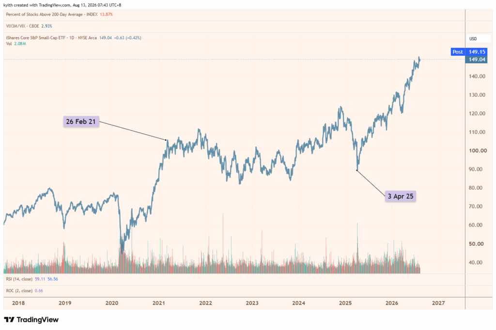
We plotted the price chart of the ETF IJR below:

I marked certain pivotal dates. You can see that the small caps went through about 4 years of funk where the total return value went nowhere.
Here is the S&P 600 forward operating earnings per share since 1999:

You would notice that the EPS is upward trajectory with dips during the recession. Then it recovers. Now each mini bar in the chart is about 1 year, and you can see the decline in EPS and stagnation starts somewhere in mid 2021 and ends probably at first half of 2025.
It largely mirrors the total return chart. The 3 red lines show the forecast of where EPS changes for 2024,25, and 26. Noticed that the forecast were too optimistic…. then recently the were too pessimistic. This should teach you a thing or two about forecasts. They give you a true north but they are not always right.
When EPS surprises to the downside… market adjust pricing down. When EPS surprises to the upside, market adjust the value up.
But 4 years is a fxxking long time. You can compare how long were the previous dips. It is like a lot of us don’t believe that small caps can have growing earnings.
And…. interest rates have not come down (which is what people say must happen for small caps to do well).
Next, this is a short 3-year chart of the S&P 600 price index plotted against the forward earnings and the forward PE:

Notice that this chat shows how well the price and earnings track each other.
But also notice that from time to time, the prices diverges from the earnings. That is when the opportunity presents itself for investors to take advantage.
The next chart shows the S&P 600 together with 3 band of PE value (10 times, 15 times and 20 times):

This shows you if the prices are running ahead of earnings. Notice it is quite common for the S&P 600 to trade above 15 times PE. But up till now, they valuation remain at 15 times during this whole recovery.
This recovery is very earnings led.
Here is another view:

It helps to show we are pretty mid here. Not really demanding.
Finally, the last chart shows how analysts are forecasting earnings growth to be:

Red line is 2025, green is this year, purple is next year.
Like we say, earnings can outrun or do worse than forecasts huh….
And so you can see in 2025, earnings growth starts at 20% before ending close to 6%. That big growth didn’t come. Looking at the 2025 line gives you an idea that your starting growth forecast can be high 20% which is what we are seeing for 2027.
You can see for 2026, we start off closer to 17% and then it dip to 13% but held steady at 15%.
So will 2027 forecast hold or disappoint? How would I know…

Kyith is the Owner and Sole Writer behind Investment Moats. Readers tune in to Investment Moats to learn and build stronger, firmer wealth foundations, how to have a Passive investment strategy, know more about investing in REITs and the nuts and bolts of Active Investing.
Readers also follow Kyith to learn how to plan well for Financial Security and Financial Independence.
Kyith worked as an IT operations engineer from 2004 to 2019. Currently, he works as a Senior Solutions Specialist in Fee-only Wealth Advisory Firm Providend. All opinions on Investment Moats are his own and does not represent the views of Providend.
You can view Kyith’s current portfolio here, which uses his Free Google Stock Portfolio Tracker.
His investment broker of choice is Interactive Brokers, which allows him to invest in securities from different exchanges all over the world, at very low commission rates, without custodian fees, near spot currency rates.
You can read more about Kyith here.
ARM & HAMMER Slide Platinum Easy Clean-Up Clumping Cat Litter, 18 lbs | 24/7 Odor Control, Triple-Action Freshness, Non-Stick, Low Tracking, 99.9% Dust Free, Multi-Cat Formula, Scented
$17.99 (as of October 16, 2026 03:11 GMT +00:00 - More infoProduct prices and availability are accurate as of the date/time indicated and are subject to change. Any price and availability information displayed on [relevant Amazon Site(s), as applicable] at the time of purchase will apply to the purchase of this product.)
Apple Watch SE 3 GPS 40mm Smartwatch | Starlight Aluminum Case, Sand Sport Band - S/M. Fitness + Sleep + Cycle Tracking, Heart Rate, Vitals, Safety
$199.99 (as of October 16, 2026 03:21 GMT +00:00 - More infoProduct prices and availability are accurate as of the date/time indicated and are subject to change. Any price and availability information displayed on [relevant Amazon Site(s), as applicable] at the time of purchase will apply to the purchase of this product.)
Core Power Fairlife Elite 42g High Protein Milk Shakes For kosher diet, Ready to Drink for Workout Recovery, Chocolate, 14 Fl Oz (Pack of 12), Liquid, Bottle
$47.98 (as of October 16, 2026 03:09 GMT +00:00 - More infoProduct prices and availability are accurate as of the date/time indicated and are subject to change. Any price and availability information displayed on [relevant Amazon Site(s), as applicable] at the time of purchase will apply to the purchase of this product.)
Amazon Fire TV Stick 4K Select, start streaming in 4K, AI-powered search, and free & live TV, find shows faster with Alexa+
$49.99 (as of October 16, 2026 03:21 GMT +00:00 - More infoProduct prices and availability are accurate as of the date/time indicated and are subject to change. Any price and availability information displayed on [relevant Amazon Site(s), as applicable] at the time of purchase will apply to the purchase of this product.)












Post Comment