Why Gold Could Be the Only Safe Bet Left When Everything Else Falls Apart—Are You Ready?
Ever thought the secret to beating the stock market was as simple as owning a little glittery metal? Sounds almost too good to be true, right? Yet, here we are, with gold quietly outpacing global equities for the past 30 years—at least for us UK investors. While everyone’s busy chasing the next big tech craze or debating AI bubbles, gold has been doing its own steady dance, delivering better inflation-adjusted returns year after year. Talk about the ultimate underdog story! But before you rush to deck out your portfolio in yellow, let’s unpack what makes gold tick, why timing your entry is more crucial than you might think, and whether this shiny relic really has a place in today’s rollercoaster markets. Curious to see how gold stacks up against stocks over decades and why it sometimes feels like Marmite in your portfolio? Buckle up—this ride is anything but dull. LEARN MORE
I have devised a new strategy for beating the stock market. All you have to do is own gold. Because gold has outperformed World equities for the past 30 years for UK investors!
Surprised? Well check out the annualised returns:
| Time horizon | Gold (%) | World equities (%) |
| One year | 40.2 | 9.1 |
| Five years | 11.4 | 7.2 |
| Ten years | 11.9 | 9.6 |
| 20 years | 9.2 | 6.7 |
| 30 years | 6.1 | 6 |
Data from The London Bullion Market Association, and MSCI. February 2026. All returns quoted in this article are inflation-adjusted total returns (GBP).
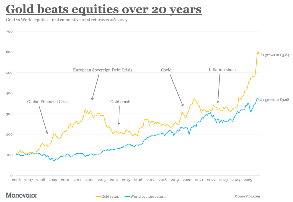
Gold is killing equities by four percentage points a year for the past five years. Though that’s a bit short term for my liking – so how about 2.5 percentage points a year for 20 years?
That’s a lot. It looks like this:

Granted, the return differential is marginal if you go back 30 years: 6.1% gold plays 6% equities. But gold is still ahead.
Plus it’s having an awesome year to date!
If gold keeps going, or the so-called AI bubble pops, then the yellow metal’s lead will spread further back into the historical record like an ink stain soaking through paper.
How long is the long term?
By the yardstick of the average mortal investor, 30 years is a pretty compelling time horizon. It certainly sounds like a long stretch for one asset to have the whip hand, no?
Don’t these numbers also call into question that story about gold basically being a shiny Ponzi scheme?
Well yes, I do think that view is too dismissive. I believe gold is worthy of its place in our portfolios.
But in my opinion the long-run performance figures above are more misleading than clarifying.
It’s not because gold beats equities that it’s useful. It’s because it repeatedly rides to the rescue when stock investors are in despair.
Gold also has a penchant for coming good during periods of uncertainty not unlike the one we’re living through now…
Golden years
The first thing to note though is that gold’s returns are highly sensitive to your chosen start date, which muddies the waters no end.
Here are three reasonable long-term baselines for comparing gold against other assets:
| Time horizon | Gold (%) | World equities (%) | Baseline |
| 51 years | 2.8 | 6.8 | Gold price fully liberated in 1975 |
| 56 years | 4.8 | 5.2 | MSCI World Index inception |
| 126 years | 1.4 | 5.6 | Dawn of the 20th Century |
Inflation-adjusted annualised total returns (GBP).
If I wanted to press the case against gold then I’d quote the 126-year timeline above, and neglect to mention the price was heavily regulated before the shackles finally came off in 1975.
On the other hand, if I was a total gold bug then I’d shout about gold and equities being neck-and-neck over 56 years.
Pick the compromise date of 1975 though and order is restored. Gold has some value as a minor diversifier, while equities remain paramount.
But their relationship is really more complex than that – and a fortuitous one for investors.
Sheer doubloon-acy
The next thing to put on the table is the 31-year mega gold drawdown:

Gold sank 78.3% over 19 years from 1980 until 1999. Buyers sucked in by gold’s 77.6% gain in 1979 (98% nominal!) didn’t break even again until 2011.
That loss weighs heavily on gold’s track record. It distorts average returns around it like a black hole bends light.
So if I pick a long-term comparison date that veers too close to that event horizon, then gold looks weak.
On the other hand, gold’s average return ticks up when observed at sufficient distance from the super-massive scary-thing pressing upon investing space-time.
Both outcomes are true, relative to the observer – as the next chart shows:

Trend lines show inflation-adjusted cumulative total returns (GBP) to 31 December 2025.
A gold investor who went all-in on New Year’s Eve 1979 (green line) would not be as happy as one who entered the market on New Year’s Eve 1969 (yellow line). Meanwhile Mr New Year’s Eve 1999 (purple line) would still be partying like Prince himself.
The upshot? Your entry point matters – as I believe The Purple One knew only too well.
The green line is the path taken by the performance-chaser who piled into gold near its 1980 peak. Notice how this sucker got hammered by gold’s mega drawdown for the first 20 years. Recovery only begins in late 1999. Eventually – more than 25 years after the comeback begins – Mr Green looks back on 2.4% annualised returns.
By contrast, the yellow line enjoys a decade of growth before giving up most (but not all) of its early gains to the 1980-99 abyss. A quarter of a century later, Colonel Mustard or whoever this is, has come through it all to post highly-respectable 4.8% annualised returns.
Finally, gold’s galactic collapse is but a historical curiosity to the purple-lined investor. For them, it’s onwards and upwards to a glittering 8.8% annualised return.
Of course, every asset’s returns are path dependent. But gold’s outcomes can be particularly divergent. Which helps explain why gold ownership is so divisive, and why some are fanatical about it and others indifferent.
In short, it’s why gold tastes of Marmite.
Crisis management
The next chart shows more clearly why gold is worth owning (I hope). See how the yellow line zigs when equities zag:

Gold and equities are both volatile as hell. They’re also extremely careless: losing decades all over the shop.
But for over half-a-century they’ve counterbalanced each other remarkably well.
In fact, nothing else has compensated as effectively as gold for equities’ worrying habit of going nowhere for years.
Meanwhile, equities typically buck up as gold spirals down.
Here’s the numbers for the lost decades for each asset shown in the chart above:
| Lost decades | Equities return (%) | Gold return (%) | Peak loss (%) | Offset at peak loss (%) |
|---|---|---|---|---|
| Dec 1972 – Dec 1984 | 0 | 144.1 | -56.1 | 191.5 |
| Jan 1980 – Jul 2011 | 655.7 | 0 | -78.3 | 665.2 |
| Aug 2000 – May 2014 | 0 | 201 | -50.7 | 8 |
| Oct 2011 – March 2020 | 104.1 | 0 | -40.2 | 53.6 |
Gold counters equities losses, equities counter gold. Inflation-adjusted cumulative total returns (GBP).
Gold returned 144% when equities went sideways for 12 years from 1972 to 1984. During that period, equities losses hit -56% in April 1980. But gold was up 191.5% at the same time.
The rest of the table repeats the same story. You can see how equities counterbalance gold’s peak losses, and vice versa. (Equity drawdowns are shaded in the table and gold’s aren’t. ‘Offset at peak loss’ is the gain of the countervailing asset when the ‘lost decade’ asset registers its worst loss.)
Driven to extraction
As that last table shows, gold refutes the old market adage: all correlations ‘go to one’ in a crisis.
Clearly gold brings its own bag of troubles along with it. But happily, equities help you bear those in turn.
Of course there are no guarantees. Gold wasn’t the best diversifier during the Dotcom Bust. It also dipped 30% initially during the Global Financial Crisis (GFC) before finally answering the alarm call.
There’s almost bound to be a financial disaster eventually that features gold and equities sliding together.
So I’m not arguing for the 60/40 portfolio to be recast as 60/40 split between equities/gold. But I am saying that gold has a solid role to play in smoothing the returns of a well-diversified modern portfolio alongside more traditional bedfellows like bonds and cash.
And yet, I still have my reservations…
Yellow alert
If you view your portfolio assets in isolation – rather than as part of a balanced team – then gold can be hard to live with. Not now, when it’s going gangbusters, but whenever it next fails to shine.
That time will come, probably quite soon, because gold is sickeningly volatile as we saw in the chart above. It’s even more of a rollercoaster ride than equities.
For example, 39% of gold’s annual returns were negative from 1970 to 2025. As opposed to just 28% of years being down for equities.
Moreover gold spent 31 years underwater up until July 2011. It then rose to new highs for all of three months before diving back in the red – where it stayed for another nine years!
Essentially, gold was underwater for over 39 years between 1980 and 2020. (While paradoxically saving the day during the GFC. So again, it depends when you bought in.)
In sum, the barbarous relic is even more painful to own than World equities as a standalone asset. If you can’t handle having your patience sorely tested, then forget about owning the yellow metal.
However, if you are willing to hold an asset for its strategic value – as opposed to highly uncertain short-term profits – then consider allocating a chunk to gold.
So metal
I’ll close out with the latest in a series in which Warren Buffett says in a couple of sentences, 20 years ago, what I struggle to say in a thousand words today.
Here’s a wonderful gold quote from the old maestro that encapsulates the dilemma:
Gold is a way of going long on fear, and it has been a pretty good way of going long on fear from time to time. But you really have to hope people become more afraid in a year or two years than they are now. And if they become more afraid you make money, if they become less afraid you lose money, but the gold itself doesn’t produce anything.
I completely buy that. You can see from the last chart that gold spikes in eras of great turmoil, when confidence crumbles in the system itself: the Oil Crisis of 1973-74, the Second Oil Crisis of 1979, the GFC, and close cousin the European Sovereign Debt Crisis.
Which brings us up to the current era of instability, which some characterise as a polycrisis. (Sounds more like a depressed parrot to me.)
If you think we’re heading for an age of peace, prosperity, and political harmony, then gold should be redundant. But personally I’m happy to wager 10% of my portfolio on fear.
After all, it looks like fear gains the upper hand quite often:

Take it steady,
The Accumulator

Amazon Kindle Paperwhite Signature Edition 32GB (newest model) – 20% faster with auto-adjusting front light, wireless charging, and weeks of battery life – Metallic Black
$159.99 (as of March 31, 2026 02:17 GMT +00:00 - More infoProduct prices and availability are accurate as of the date/time indicated and are subject to change. Any price and availability information displayed on [relevant Amazon Site(s), as applicable] at the time of purchase will apply to the purchase of this product.)
Bolux Dog Harness, No-Pull Reflective Dog Vest, Breathable Adjustable Pet Harness with Handle for Outdoor Walking - No More Pulling, Tugging or Choking (Blue, S)
$13.99 (as of March 31, 2026 02:20 GMT +00:00 - More infoProduct prices and availability are accurate as of the date/time indicated and are subject to change. Any price and availability information displayed on [relevant Amazon Site(s), as applicable] at the time of purchase will apply to the purchase of this product.)
SIXFU 4 Sizes of Ear Tip Replacement Compatible with AirPod Pro and AirPods Pro 2 Ear Tips with Portable Storage Box & Cleaning Kit, Noise Reduction Hole & Dense Dust Guard Screen(XS/S/M/L)-White
$7.99 (as of March 31, 2026 02:17 GMT +00:00 - More infoProduct prices and availability are accurate as of the date/time indicated and are subject to change. Any price and availability information displayed on [relevant Amazon Site(s), as applicable] at the time of purchase will apply to the purchase of this product.)
Replacement Remote for Fire Smart TV, Compatible with Insignia Toshiba TCL Hisense Fire Smart TV, Simple Setup, Voice Control, 1-Year Warranty - Not for Roku OS
$7.99 (as of March 31, 2026 02:17 GMT +00:00 - More infoProduct prices and availability are accurate as of the date/time indicated and are subject to change. Any price and availability information displayed on [relevant Amazon Site(s), as applicable] at the time of purchase will apply to the purchase of this product.)


Post Comment